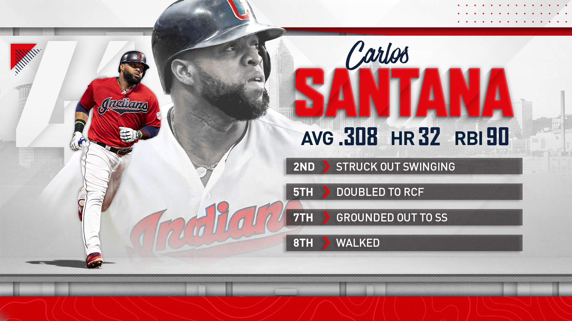
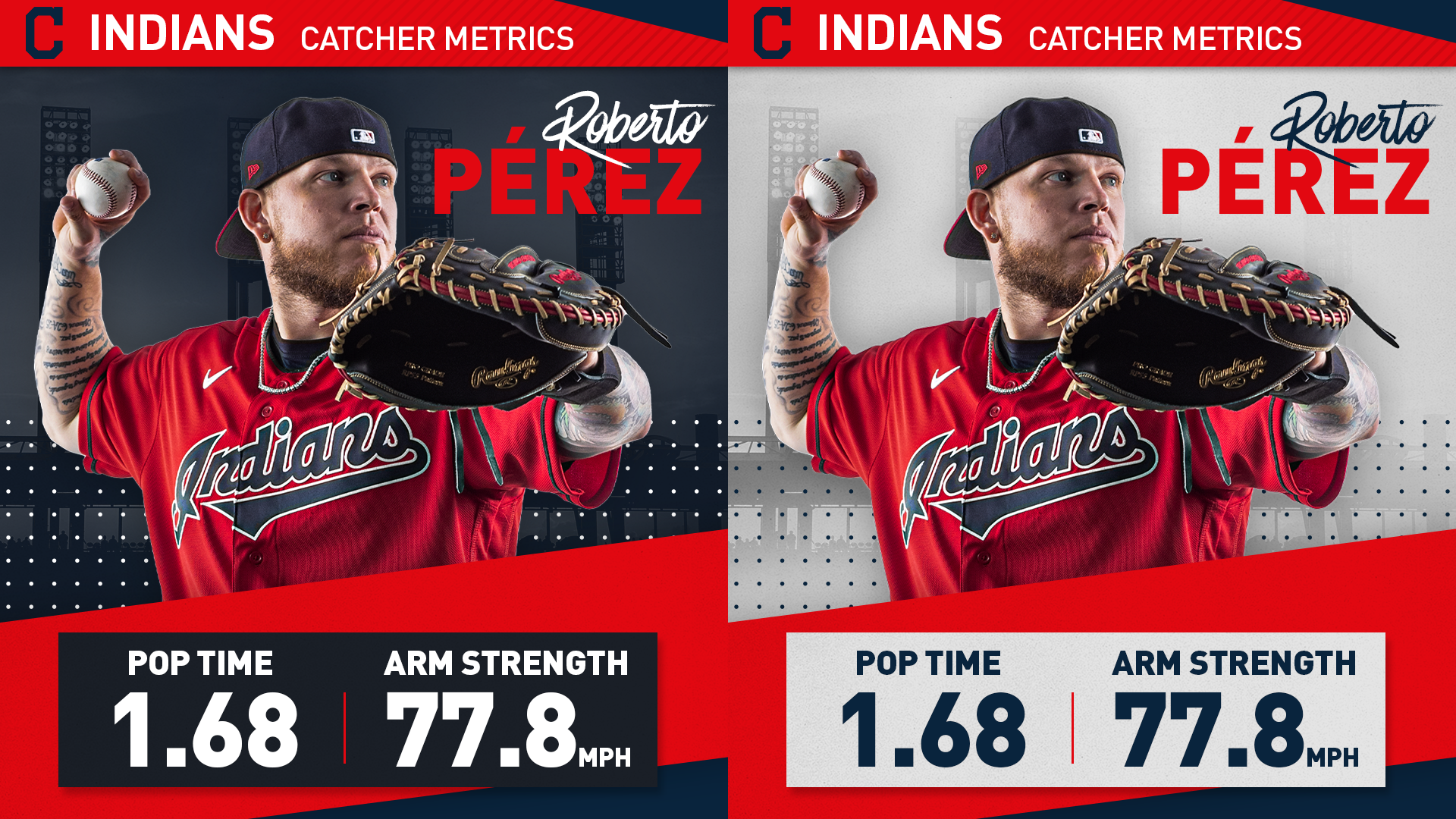
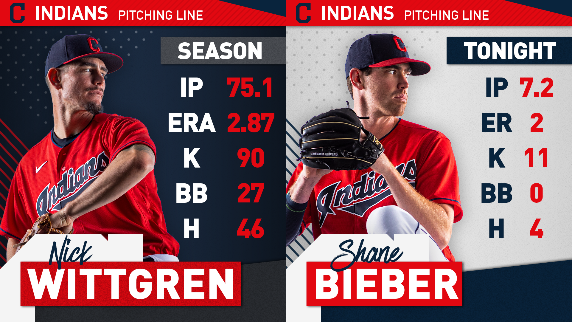
For the 2020 brand campaign the keywords were 'Hustle,' 'Fresh,' and 'Fun.' Goals were to celebrate unique personalities and identities of our players.
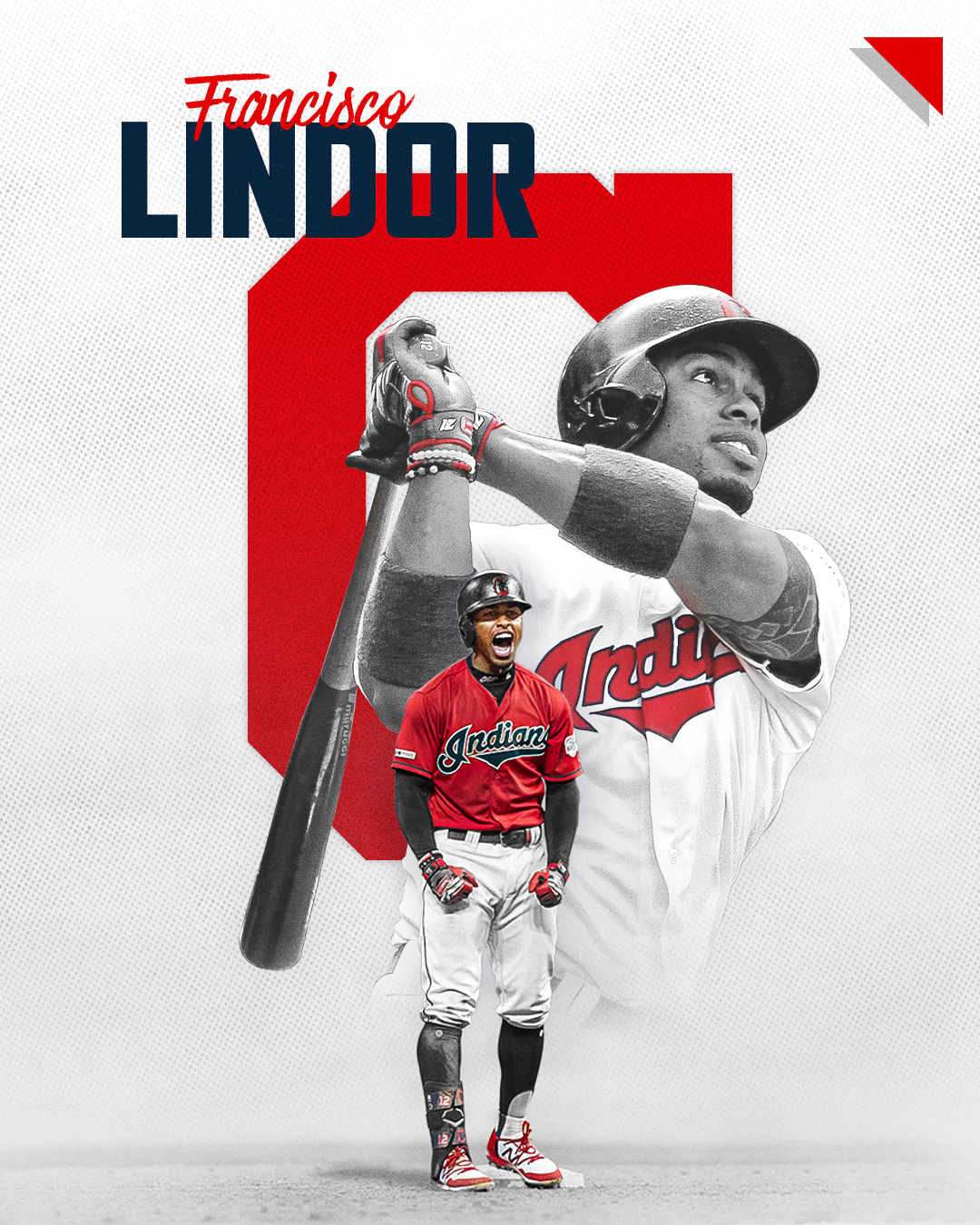
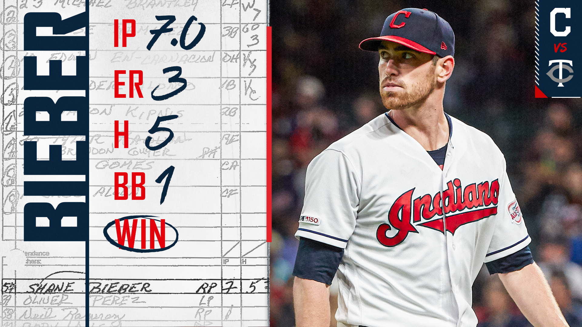
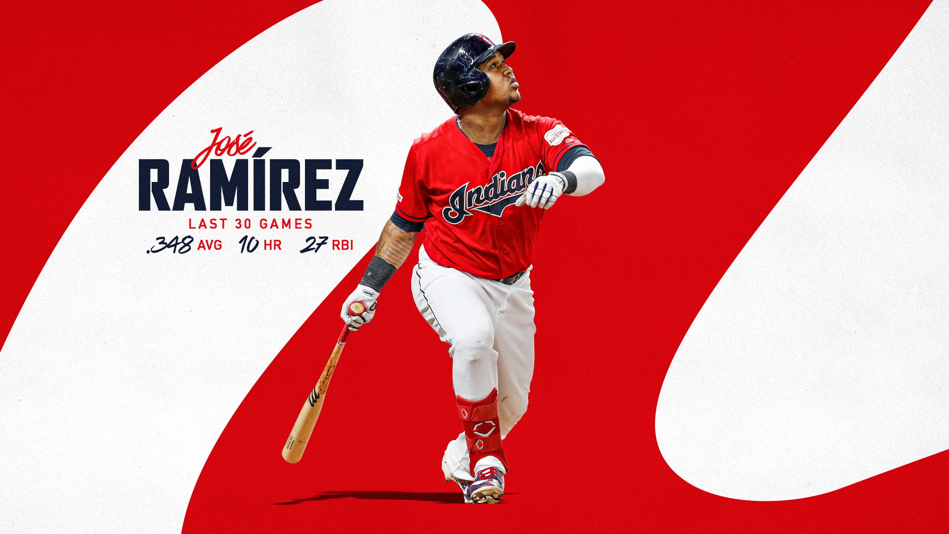
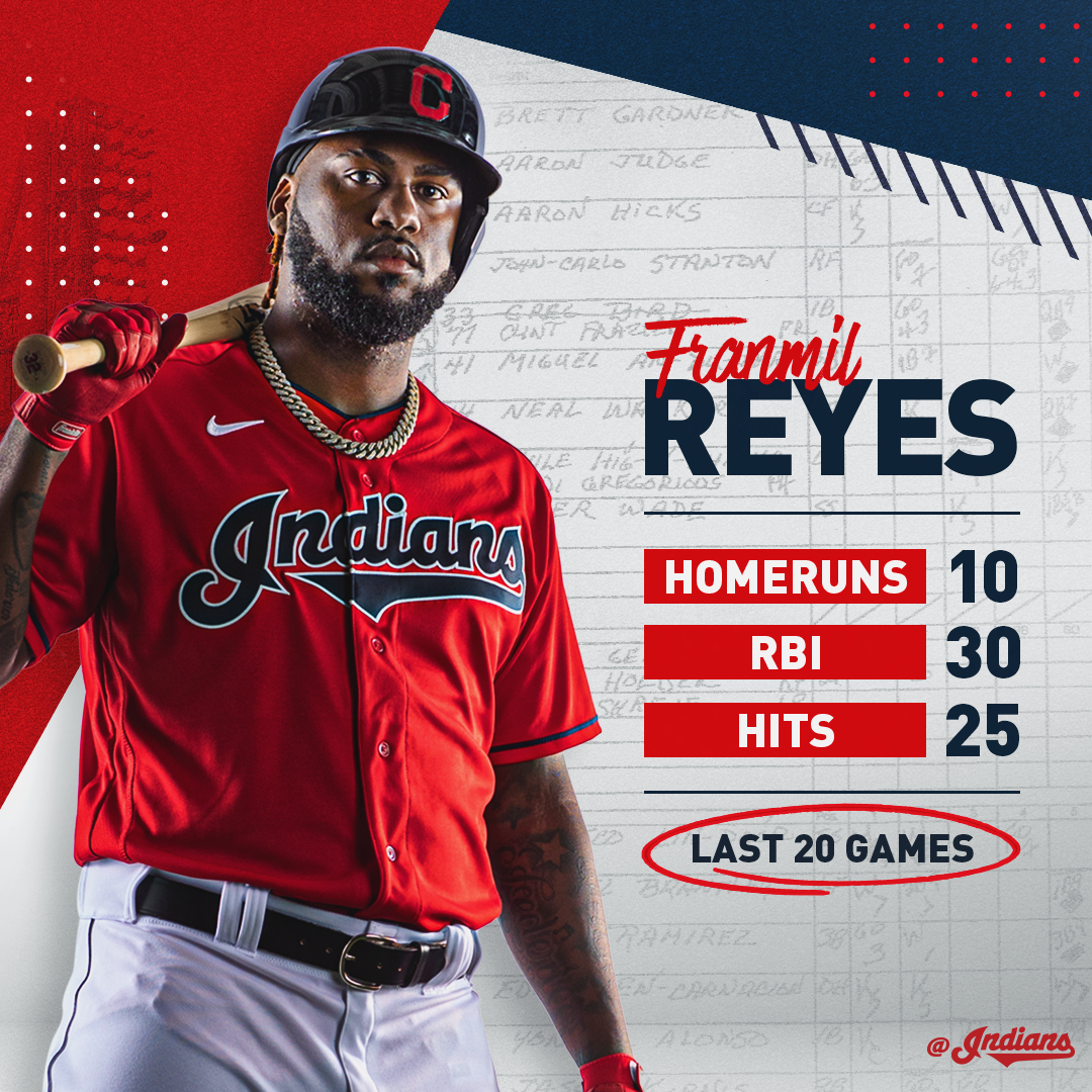
To highlight these campaign attributes I decided to use bright, bold, reds on white backgrounds to evoke an energetic feeling. Instead of the gritty looks from the previous seasons, we went for a cleaner style, using hard angles and geometric shapes while utilizing white space to allow graphics to breathe. Adding in a handwritten font was a way to tie into the personality portion of the campaign, as well as incorporating actual box scores written by our PA announcer. We also began targeting photos showing players unique equipment (such as cleats and gloves) to highlight their individuality and style. Lastly, we leaned into the red jerseys that were introduced in 2019, they were well received by fans and players alike, and became a large part of the team identity.
I also created a basic guidelines document for how to execute this look. It was used by our social media team and design partners. (available for download here)
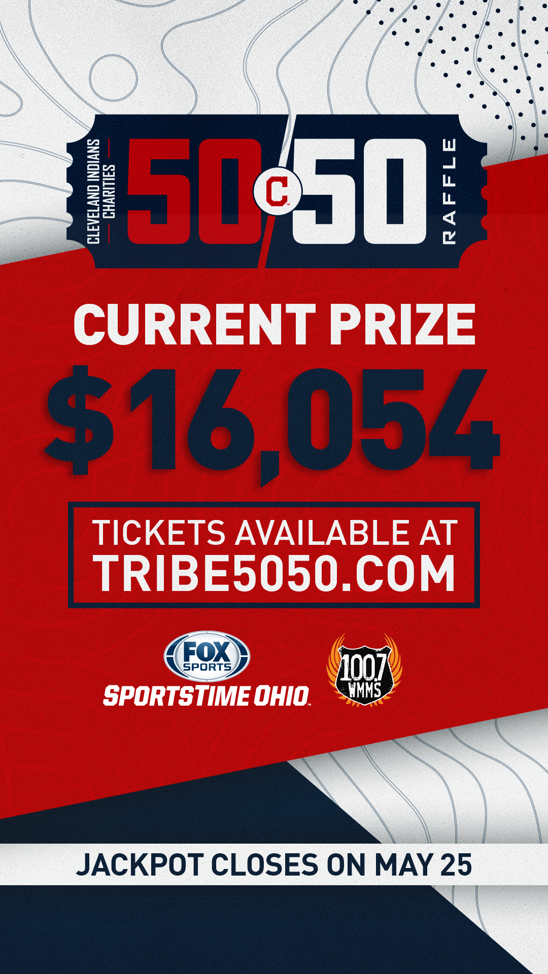
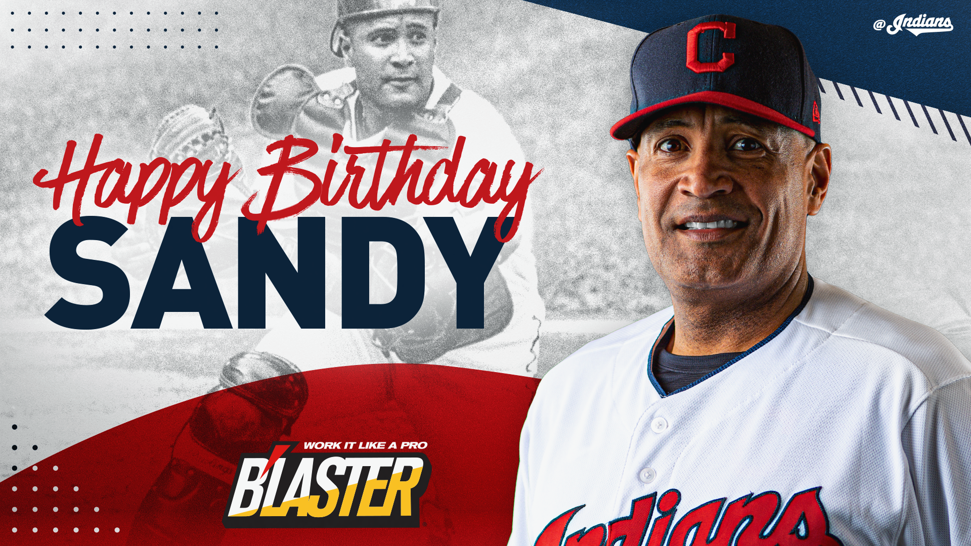
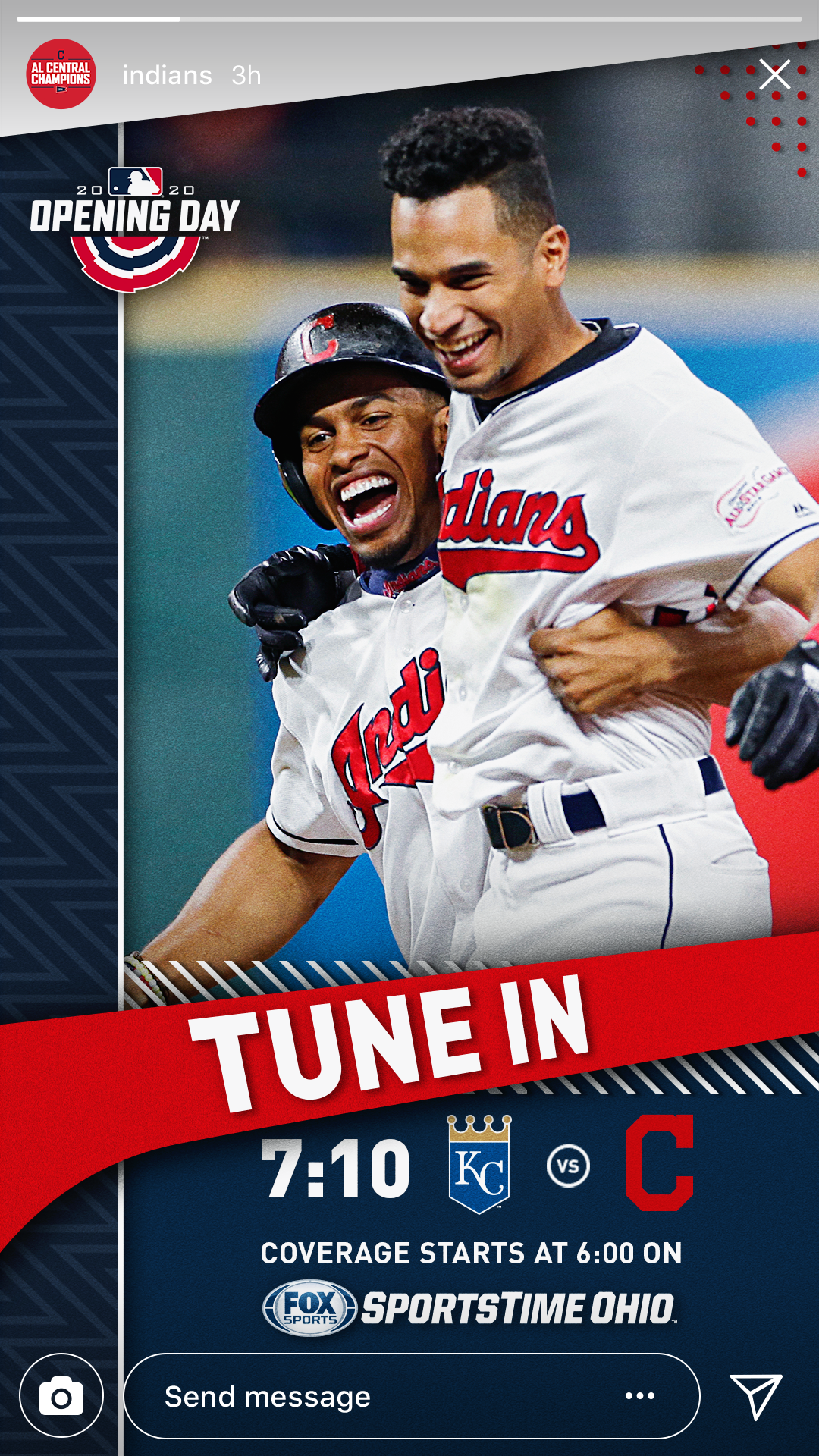
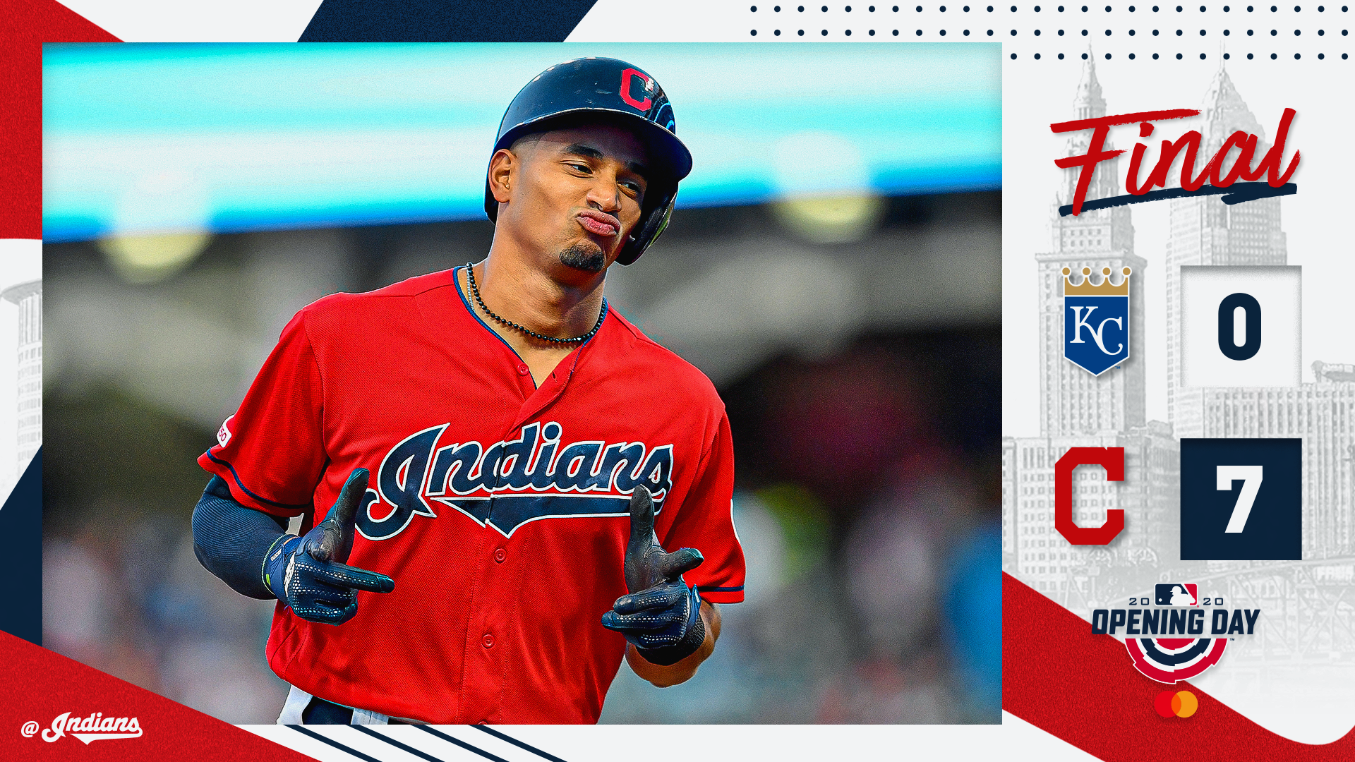
Social Media Templates
Graphics designed to be easily editable for social media managers to update as needed throughout the season.

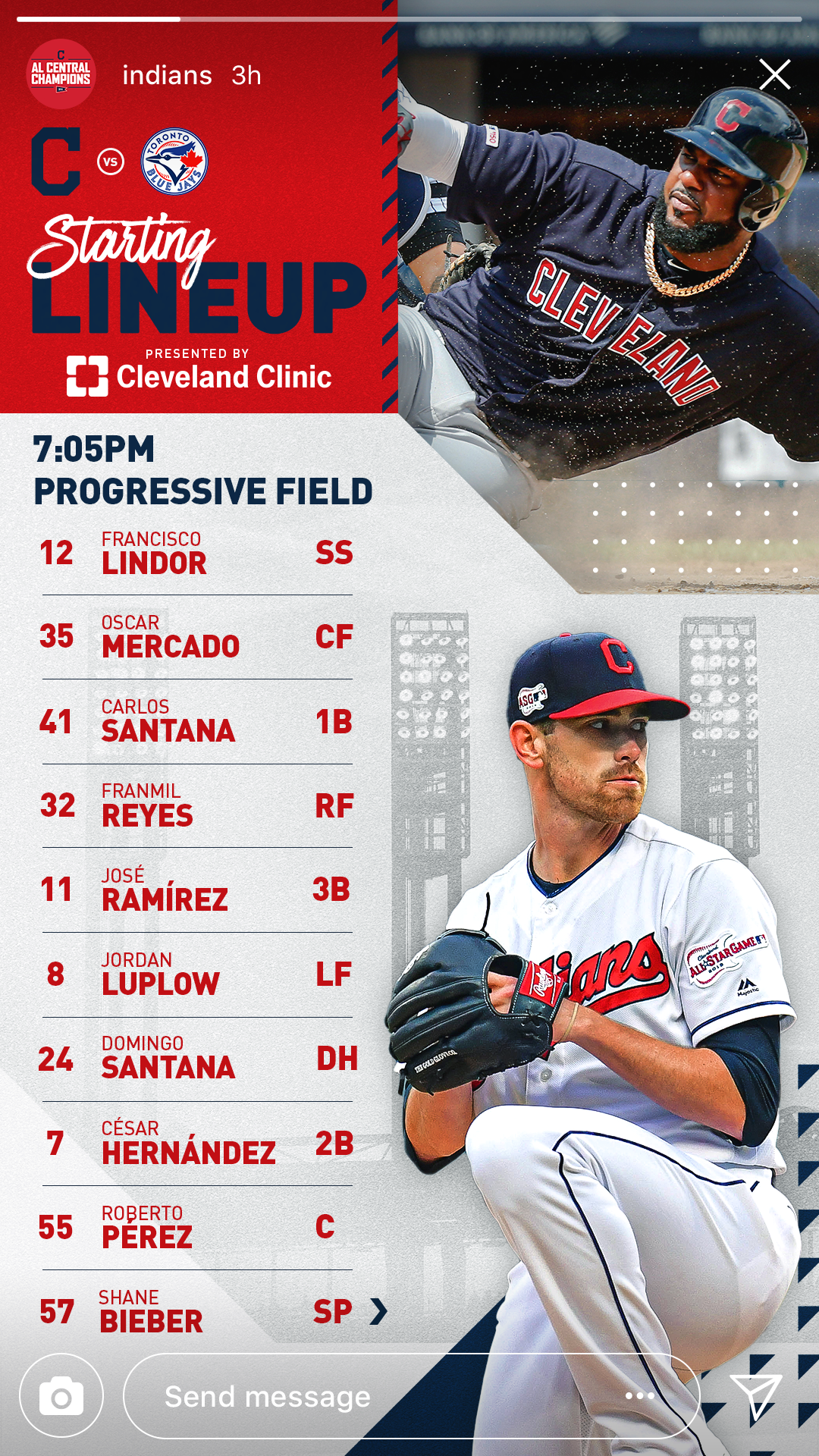




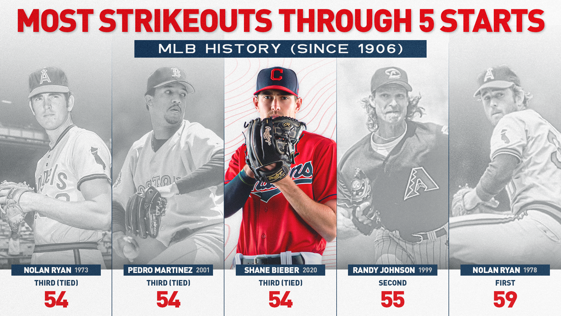
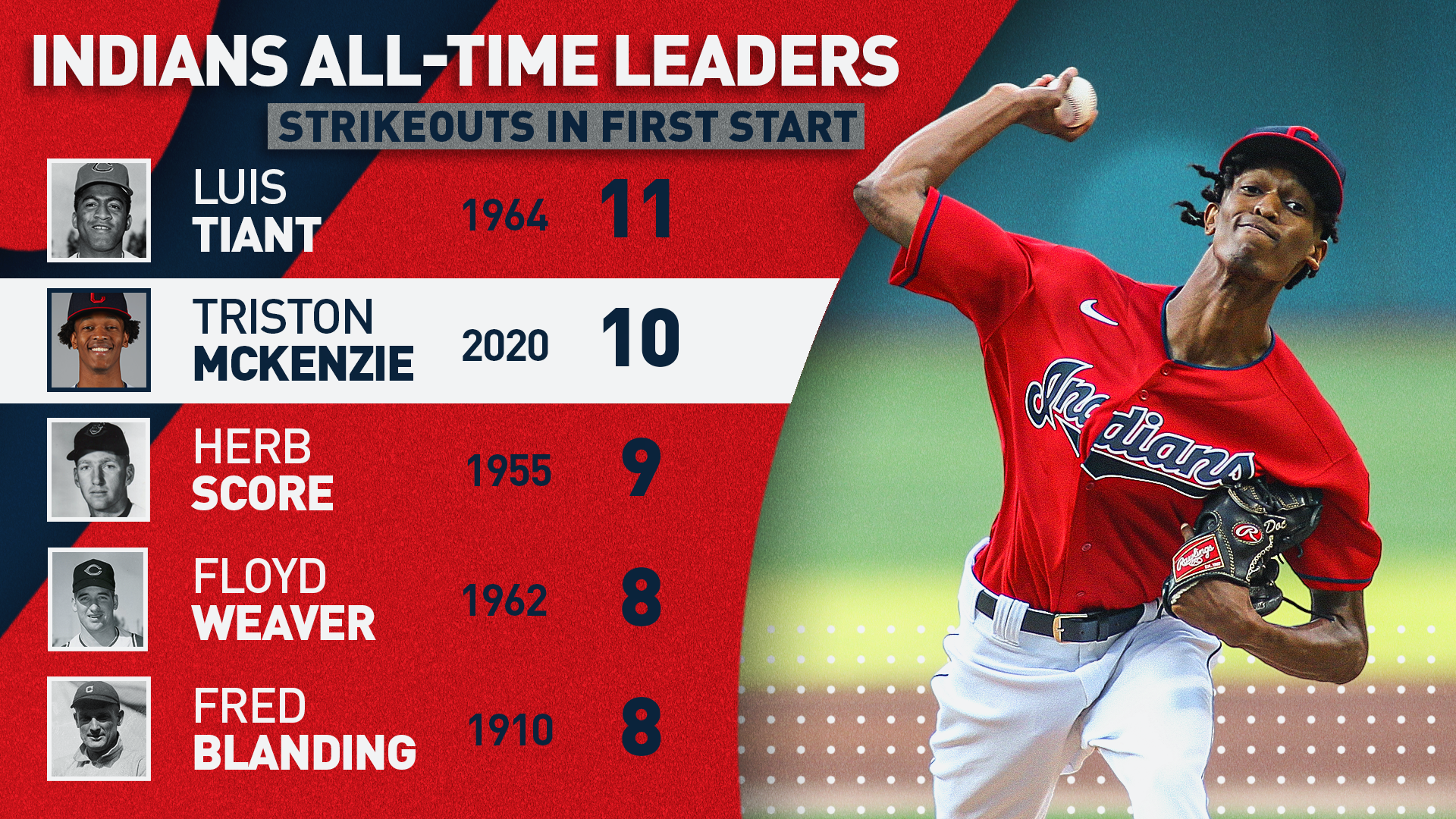
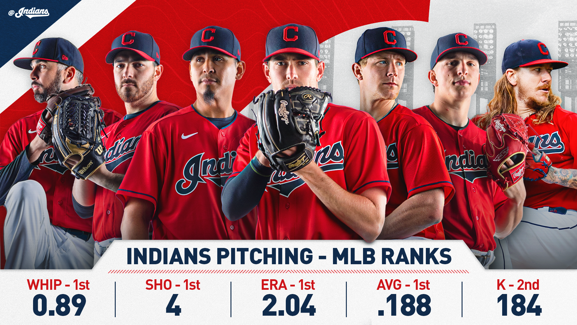
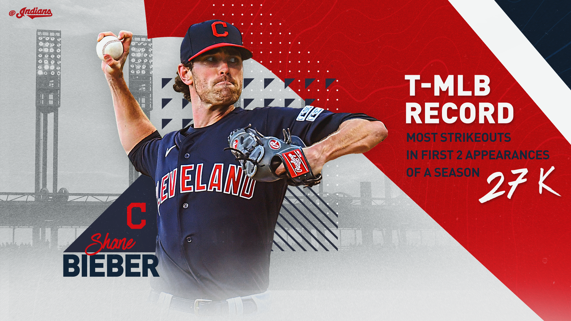
Stats and Records
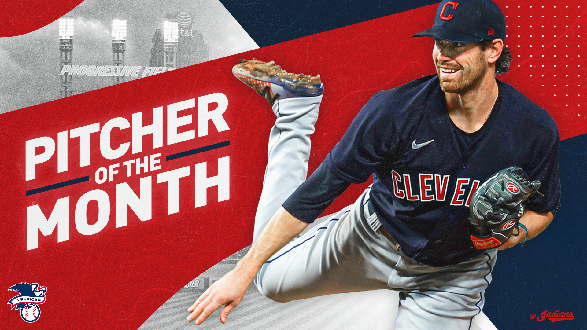
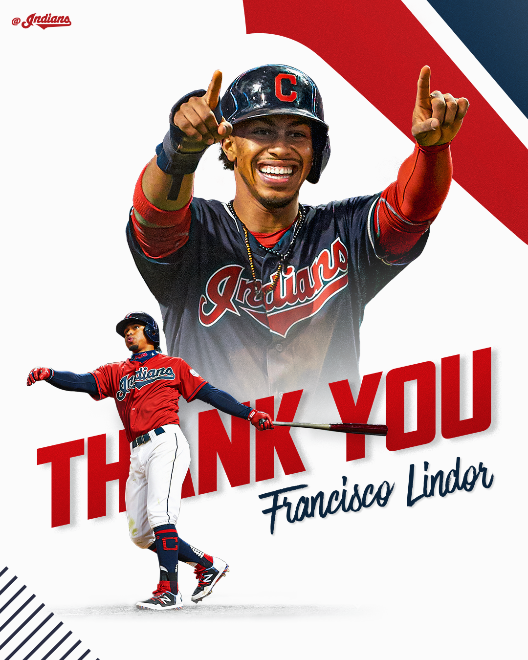
Additional graphics created to highlight achievements, milestones, and one time occasions.

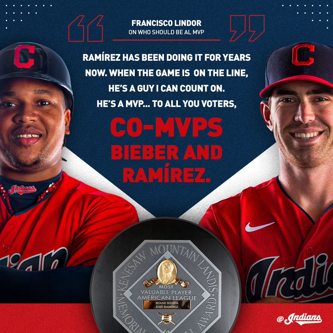
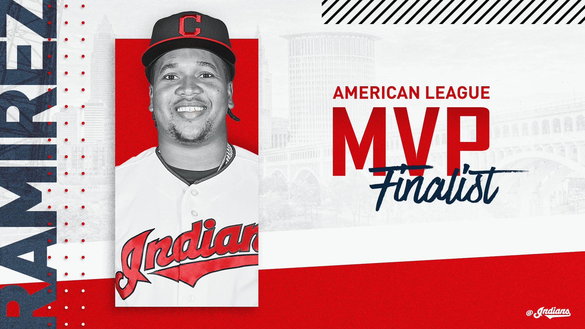
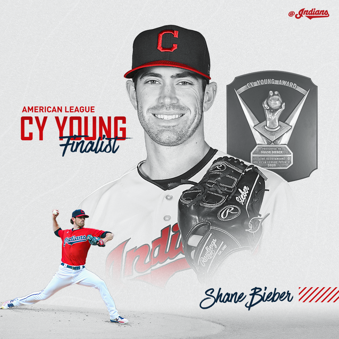
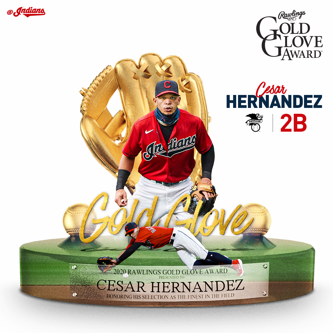
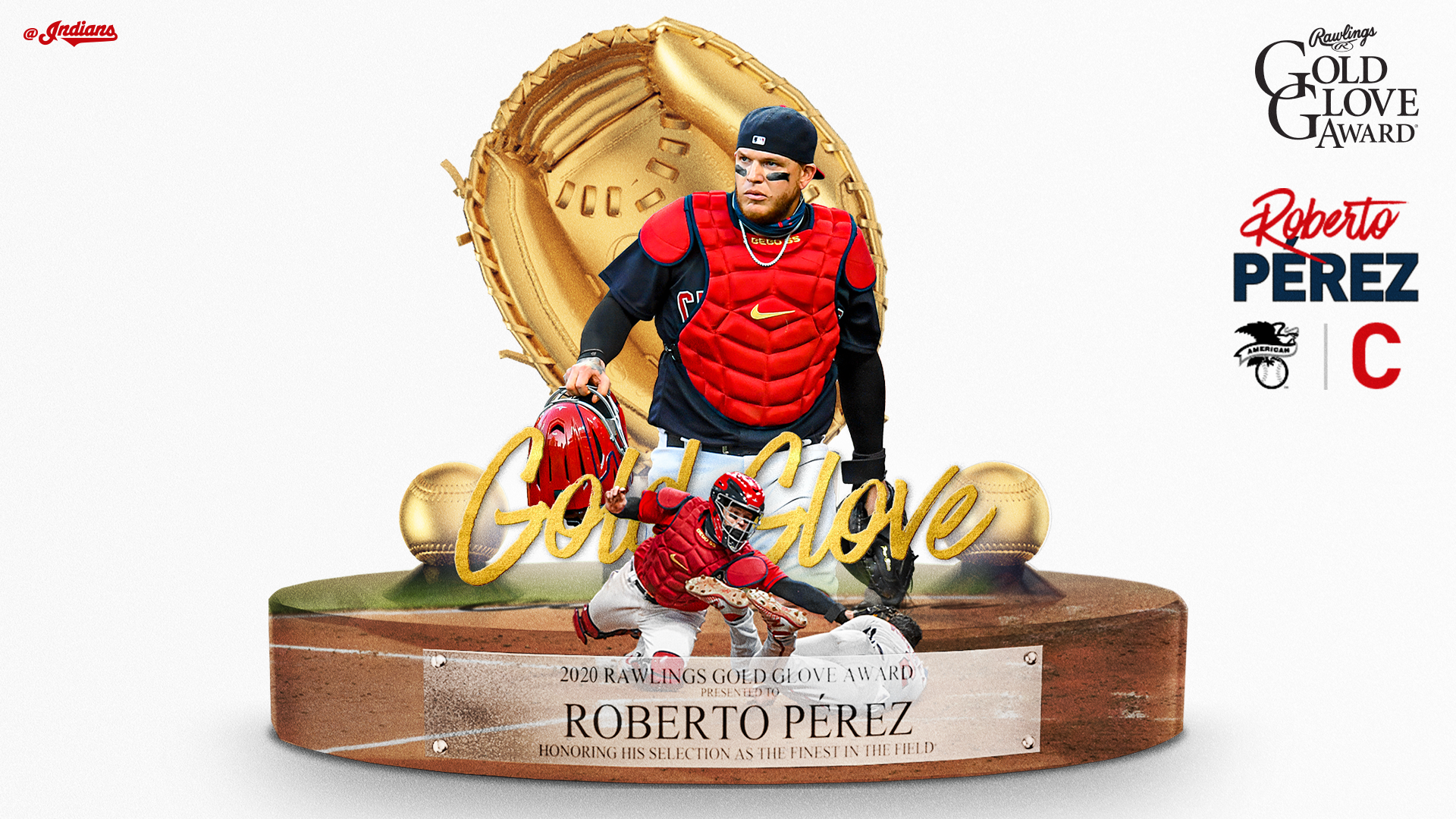
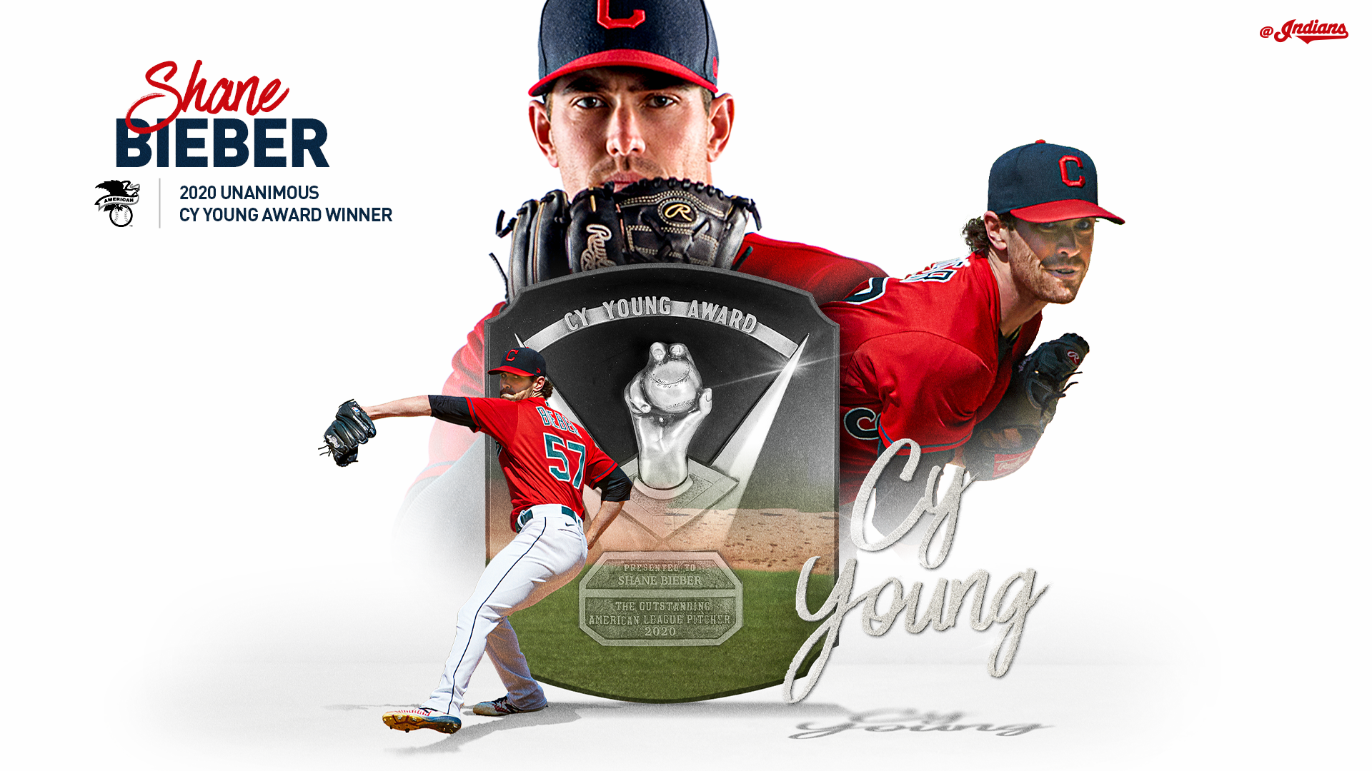
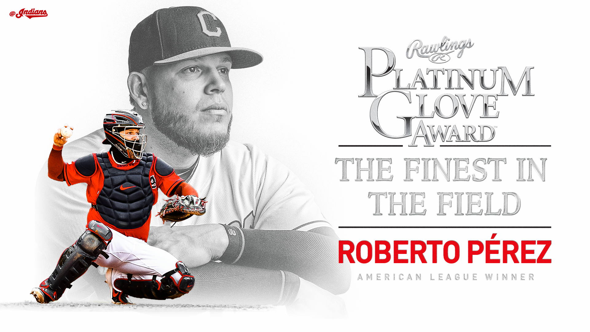
Awards


Scoreboard Layout and Headshot Designs
Game in progress layout and additional looks to showcase specific stats or highlight plays on the field. Included is a light/dark mode for day and night to optimize scoreboard visuals on TV broadcast.


